Redefining Shine: Visual Storytelling for Reliance Jewels
UI/ UX case study
Project Overview
Responsive Website Redesign (Web & Mobile Web)

Reliance Jewels, a leading Indian jewelry brand, wanted to enhance its digital presence. The previous website suffered from poor usability, unclear structure, and a dated interface. The redesign aimed to modernize the website visually and functionally while improving discoverability, trust, and conversions—especially across mobile devices.
Simplify navigation and product discovery
Increase trust and confidence during online jewellery purchases
Improve mobile experience through responsive and thumb-friendly design
Add emotional engagement through visual storytelling
Streamline the checkout journey to reduce drop-offs
Research Outcomes
Users were hesitant to purchase high-value items online due to concerns over authenticity, certification, and return policy clarity.

User Persona
I love jewellery, and love to own them too, but going out to every brand is hectic. want to see lots of option before making final decision
Yoshika, a busy working professional, juggles her demanding job and household responsibilities, leaving her with limited free time. Despite her hectic schedule, she's passionate about jewelry and enjoys exploring various types online. As a tech-savvy individual, Yoshika regularly shops online, occasionally purchasing jewelry. However, she's cautious due to the rising number of online scams and frauds, worrying about the quality, support, and whether the piece will suit her. She sometimes misses the tactile experience of offline jewelry shopping, where she can try on pieces and get a better sense of their quality.

Goals
Users abandoned carts due to surprise charges, missing delivery info, or a complicated flow
Frustration
To own a jewellery set for every occasion
To explore multiple options
Not to buy duplicate or fake Jewellery
Get best product at reasonable rate.


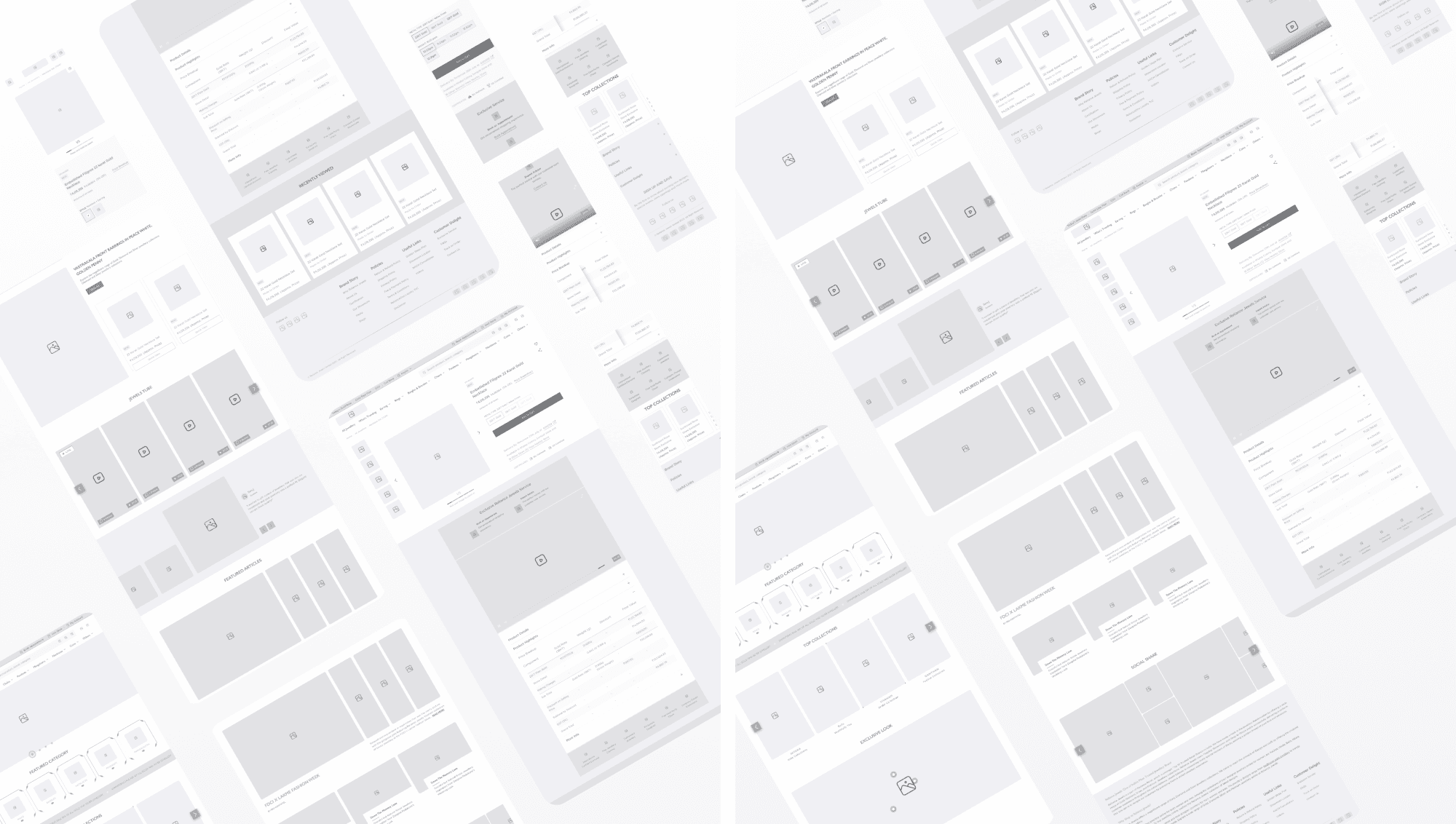
Wireframe
Based on the research insights and UX strategy, we created wireframes to define the information hierarchy, layout logic, and interaction flow across key pages. These low-fidelity structures served as the blueprint for validating design decisions before moving into high-fidelity UI.
Key objectives addressed through these wireframes:
Homepage
Prioritized visual storytelling
Category discoverability
Trust-building elements
Product Description Page
Structured to highlight key product information
Imagery
Trussocial proof while ensuring ease of scanning and decision-makingt-building elements
Cart & Checkout
Simplified structure for transparency
Reduced friction
Mobile-first usability
Mobile Web
Special considerations for screen real estate
Tap targets
Sticky interactions to cater to the 70%+ mobile user base.
Evolving Wireframes into Visual Impact
After validating wireframes and gathering stakeholder feedback, we transitioned into high-fidelity designs. The focus was to align aesthetics with brand storytelling while solving real user pain points identified during research. The design system was created to be scalable, emotionally engaging, and conversion-driven.
Here are the key design decisions and improvements made:
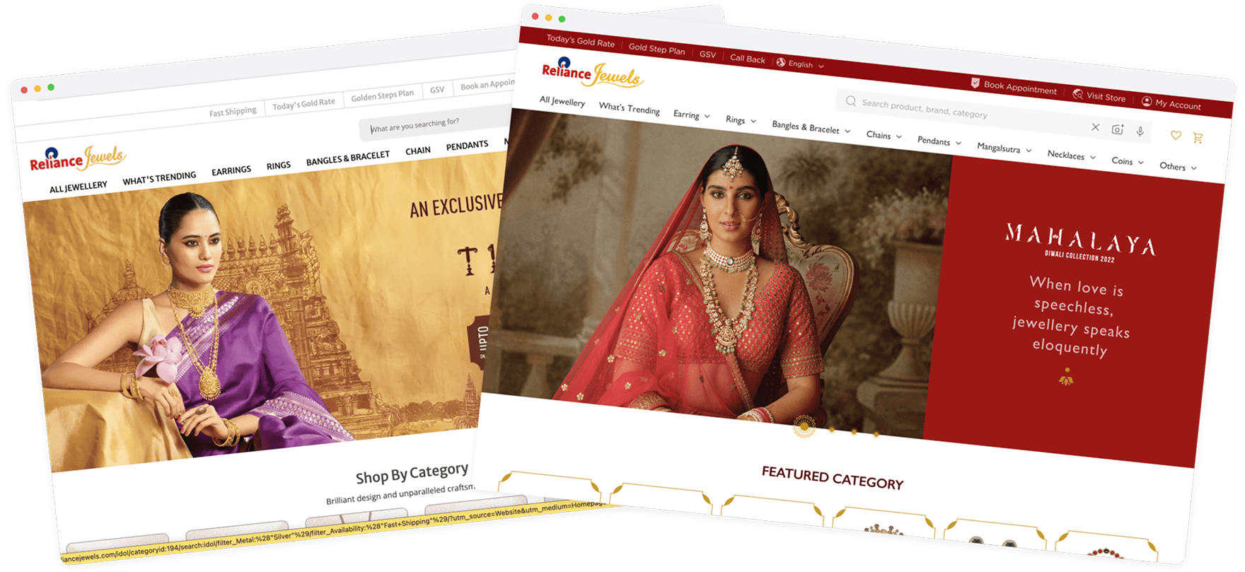
Homepage — Brand Storytelling & Discovery
Introduced large visual banners to highlight collections and craftsmanship
Showcased featured categories and offers through interactive modules
Used deep gold, white, and minimalistic design tones to elevate elegance
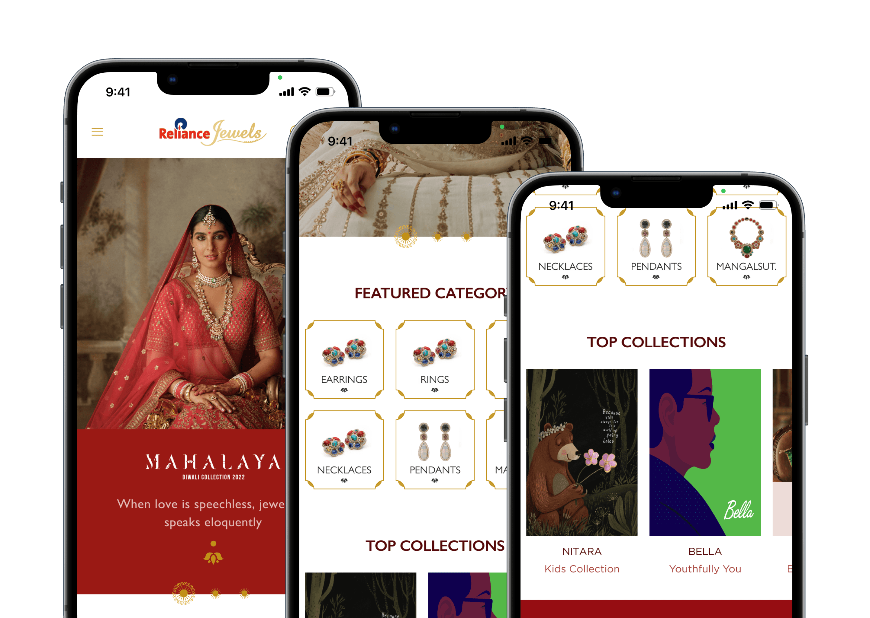
More hierarchy, clean category entry points, trust signals above the fold
PDP
Conversion - Centric Design
Added sticky CTAs on mWeb for quick action
Restructured product information — key details like price, gold weight, and offers now appear above the fold
Added “You May Also Like” for exploration and upsell
Created a clear visual separation between product image, price, and action areas
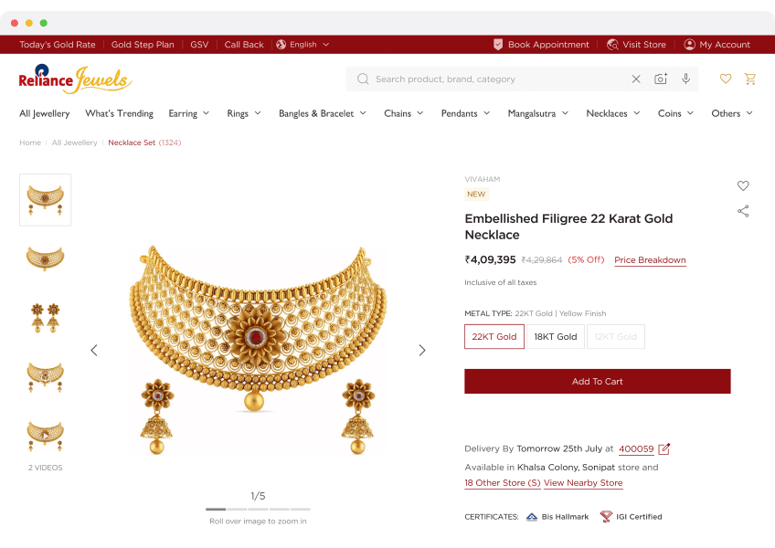
Clarity in pricing, stickiness in CTA, improved visual hierarchy
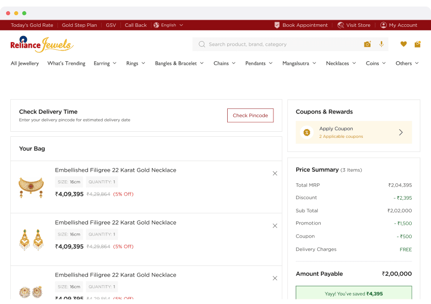
Cart
Clarity and Action
Clear grouping of products, offers, and pricing
Highlighted total savings, delivery options, and CTA prominence
Designed mobile cart with progressive disclosure, showing the right info at
the right timeIntroduced “Remove” and “Save for Later” with icon-led clarity
Seamless transition from product to checkout
mWeb Optimization
Bigger touch targets and spacing for tap comfort
Sticky buttons for “Add to Cart” and “Buy Now”
Accordion-based collapsibles for info like description, policies, etc.
Prioritized speed and glanceability of price, image, and actions
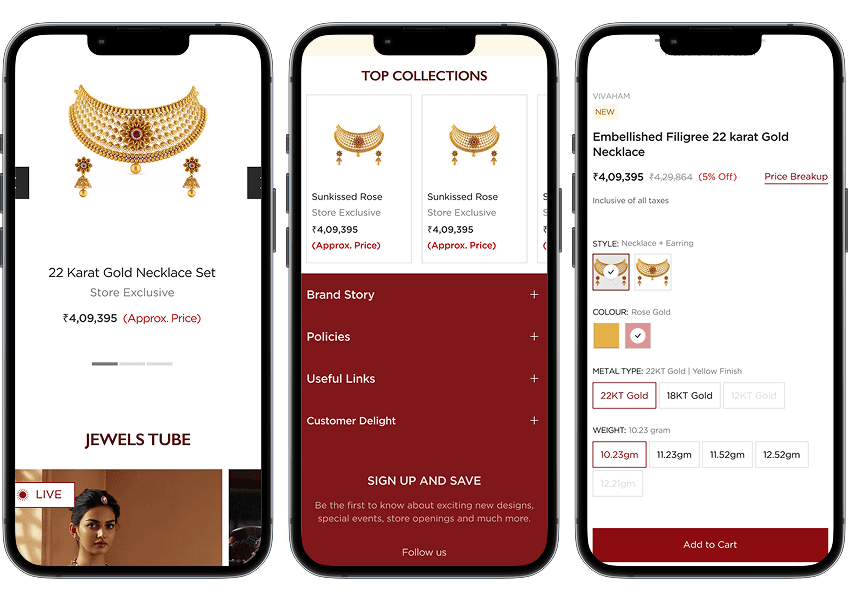
Seamless transition from product to checkout
How Design Enhanced User Experience
High-fidelity designs didn’t just elevate the visual aesthetics — they were rooted in solving specific user problems and improving functional experience.
Here’s how the design translated into better UX:
Clarity & Readability
Clear typographic hierarchy made product details easier to scan.
Logical grouping of information reduced cognitive load.
Use of visual separators and white space guided user attention intuitively.
Mobile-First Thinking
Sticky bottom nav, large touch targets, and faster filter interactions created a seamless mobile journey.
Reduced form friction and minimized scroll-fatigue during checkout.
Guided Navigation
Improved navigation structure (both top nav and breadcrumbs) helped users know where they are and what to do next.
Persistent access to key actions like wishlist, cart, and support boosted usability.
Mobile-first usability
Emotional & Trust Building
Use of lifestyle images, testimonials, and trust badges built emotional engagement and reduced purchase hesitation.
Festival-driven banners and offers connected with the Indian jewelry shopper mindset.
Faster Decision Making
Feature comparisons, tooltips, and segmented specs made it easier for users to evaluate and decide quickly.
"Recently Viewed" and "You May Also Like" supported natural exploration.
Mobile-first usability
Checkout Confidence
Clear pricing, visible delivery timelines, and a progress indicator gave users confidence while completing the purchase.
Final Learnings & Takeaways
This project reinforced the principle that design is not just about how it looks, but how it works — especially in high-stake, emotion-driven categories like jewelry.
Trust is UX
Users won’t convert unless they trust what they see. Transparency and credibility cues should be baked into every touchpoint.
Emotional context matters
Jewellery is not just a product — it’s a story. Telling that story visually enhances brand connection.
Mobile matters most
A refined mobile experience is non-negotiable when most traffic comes from handheld devices.
Simplification wins
Simplifying complex product info through layout, visuals, and interaction boosts engagement and conversions.
Small UX details drive big results
Sticky actions, helpful microcopy, and intuitive feedback loops all add up to a smoother journey.