Pixels with Purpose, Stories in Style.
Have a look at the ideas I’ve brought to life.

Visual Hierarchy
Guide the eye, frame the story.
Use size, color, contrast, and spacing to highlight what matters most and lead users through the interface naturally.

Balance & Harmony
Aesthetic meets logic.
Maintain balance through grid systems, alignment, and spacing—ensuring that elements feel intentional and visually pleasing.

Contrast for Clarity
Make it pop with purpose.
Contrast isn’t just style—it’s accessibility. From color and typography to layout, use contrast to create focus and legibility.

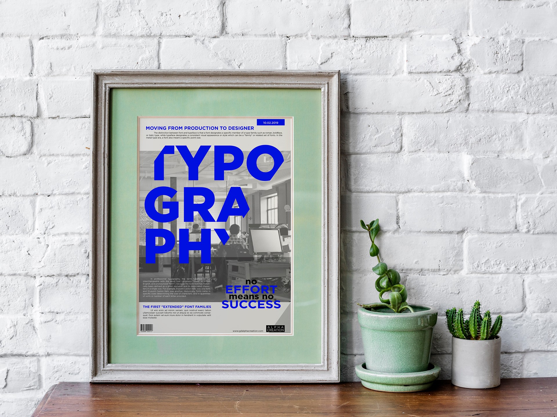
Typography as Voice
Type sets the tone.
Font choice, hierarchy, and spacing shape how your message is heard. Good type design equals good communication.
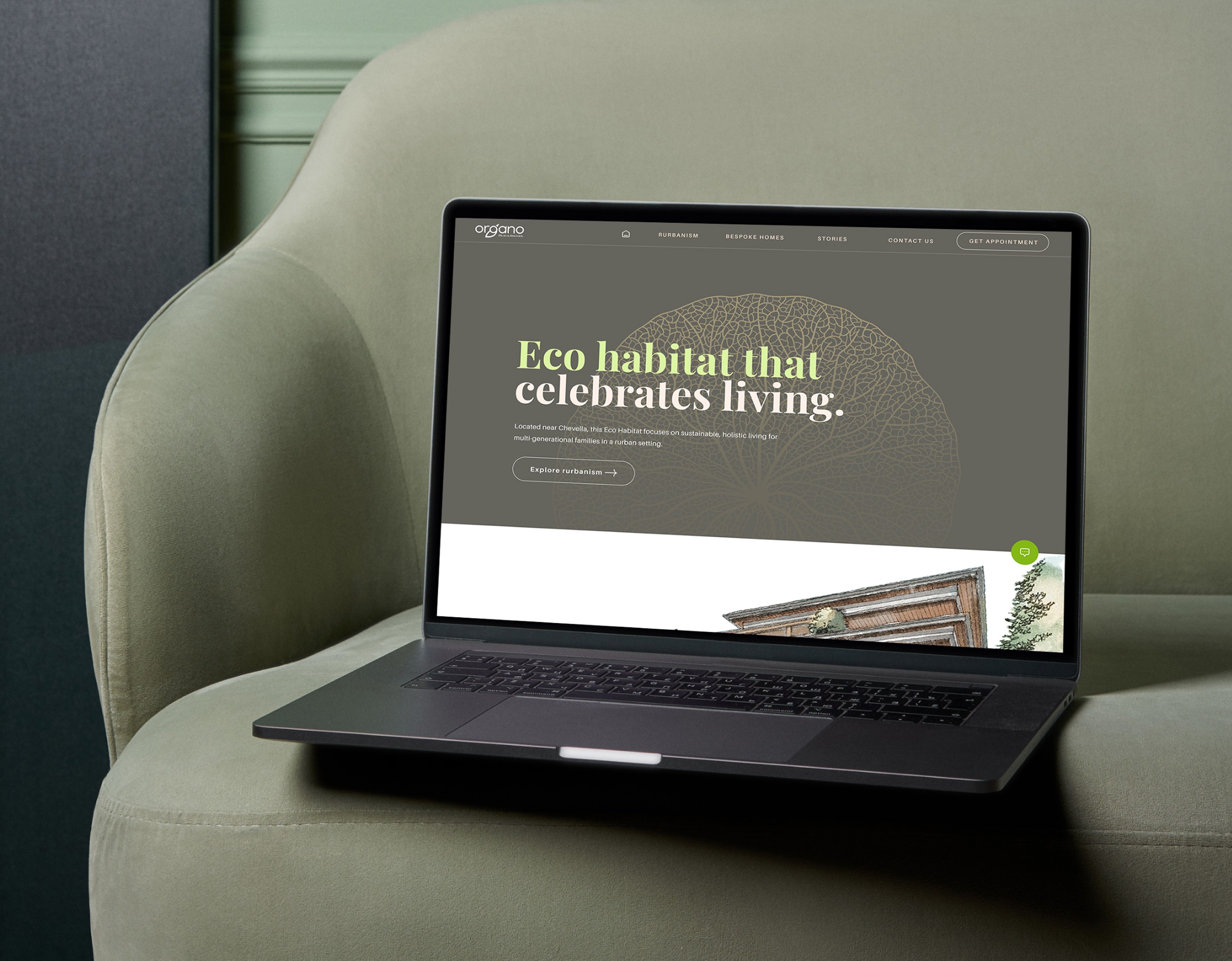
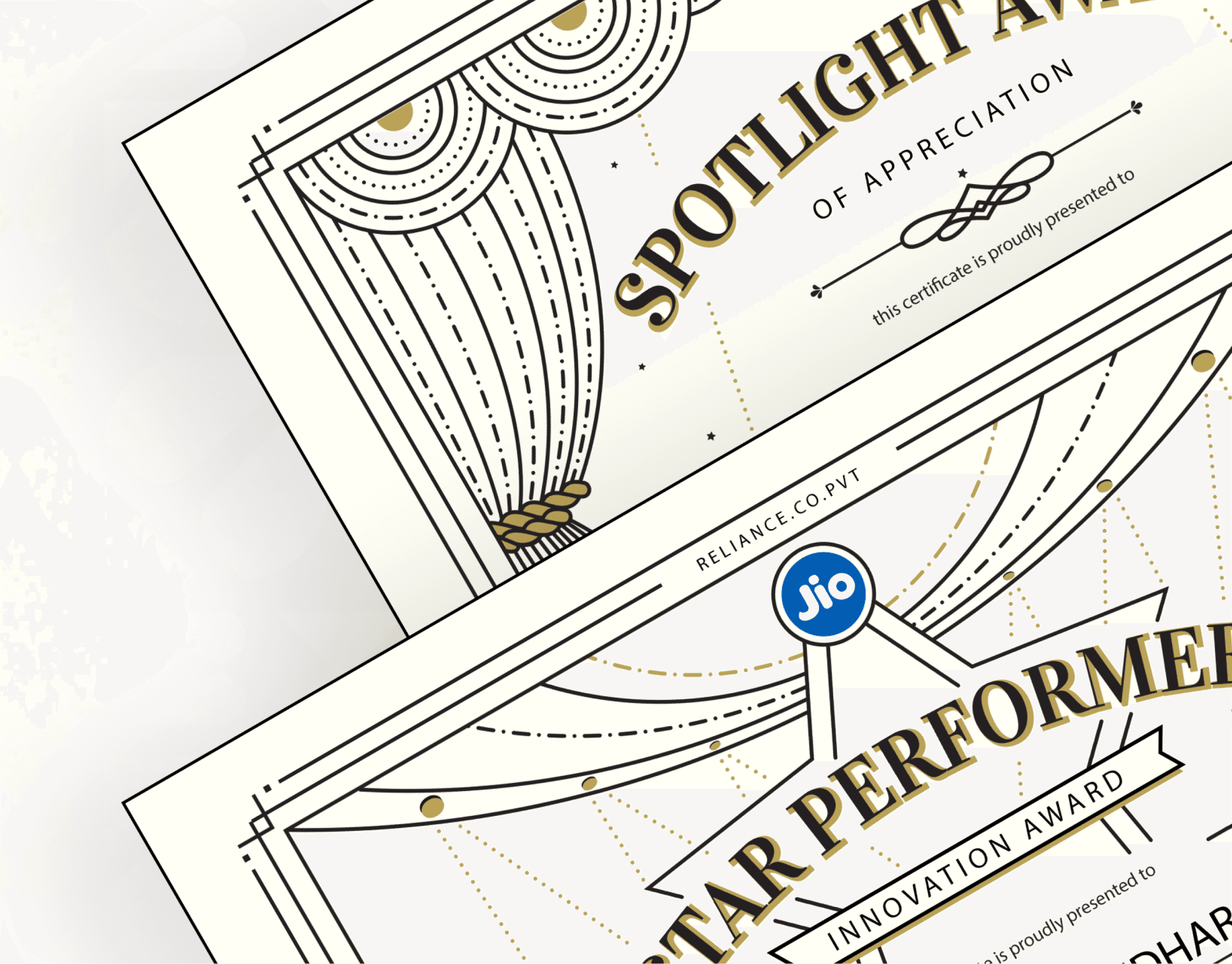
User-focused, detail-driven
here’s what I’ve built.